This is the first Focus Week of Year 3. I have decided to use the focus weeks this year to develop my model making skills, computer knowledge and graphic design.
I will achieve this by using the workshop at Kingston and also use different and imagnative materials to create the models. I am particularly interested in sci fi related models and using inspirtation such as Archigram. I will take these ideas and look at the London of the future.
As London is an overcrowded and medieval city I have always felt that building up is the best option. Of course if you look at sci movies this is not always the best option. In the case of Blade Runner to name but one, we see cities becoming bleak and crime ridden as building shoot up and life below becomes poverty stricken and dark.
I feel this is interesting. I poropse to suggest that a new capitol is formed, almost like a city above our present city. This New London will stand proudly above on pilotis. I choose pilotis often in my projects as I like their monumental look and I also enjoy the way they free up the space below allowing a sense of openness.
So far this week I have created my principle building which will be the HQ. I have called it the Ministy of Moral Order. This future city is not based on our current understanding of politcs and such matters but a kind of new philosophy.
The Ministry of Moral Order dominates the cityscape with sharp abstract forms. I wanted to take the idea of a rocky landscape or mountain and almost chissel it out into a sculptural form. This creates the basis for the Ministry where great halls open up to form interesting indoor outdoor spaces. The top of the Ministry has a building that reaches upwards in ambition. Here I wanted to play on the idea of great Gothic Cathedrals reaching towards the heavens. It is in a contrasting white with yellow/green panes of glass. Again I choose this material to add a little oddness to the model, I felt that it should have a quirkyness to it. The whole building is out of shape but yet in shape. There is method in the madness. I aimed to suggest that New London's moral HQ is a building but a building full of surprises and jaunty angles.
My next step is to work on models for the residential buildings. Here I intend to create sleek sky scrapers with layers of balcony gardens and green space. They will be dotted all around the new city as I am a believer that residential building should be within city centres as it tends to ensure areas are occupied and people are watching and looking out for trouble.
Once I have created the models my intention is to arrange to photograph them at the studio in Kingston Uni. Then I am going to create a set of visualisations to show what New London will look like. At this point I see our London becoming overshadowed by the new. This will result in some vegatation taking over and perhaps building becoming run down. At this point I have not fully developed the look I will go for. However I will take inspiration from Archigram and create visualisations which will be poster like.
This is a good chance to work on my graphic design skills. As I enjoy collage making I think overall these posters will look both stunning and interesting. Graphic Design is also a great interest of mine and I think its an important part of the Landscape Architecture vision.
This week I have also ordered the Adobe Package and am waiting for it to be delivered. One of the packages is DreamWeaver and I am excited about learning to use this product. My intention alongside Focus Week is to learn to create a website. I have so far checked out tutorials on U tube. It does look complex but I'm sure once I stick at it, it will reveal itself. The overall ambition is to continue using this blog until such time as I get a proper website up and running.
The final element of my Focus this year will be on exhibitions and keeping up an informed knowledge of not only whats going on in Landscape Architecture but other design areas. I have found since starting at Kingston I have an overall interest in many fields of design. I enjoy fashion as well as architecture. Product and furniture design is exciting as well as graphic arts. I feel that it is an advantage to seek out inspiration in these different areas and use them to inform Landscape Architecture projects.
The reason I have chosen to focus on model making is it is my favourite area of the course and I am considering becoming expert in this field and perhaps moving into an architectural model making career. This is not set in stone but I feel it is the direction I am taking. By the end of the year I aim to have a stylish website up in running, some well made models, good visualisations of these as well as reviews of interesting exhibitions. I may even get some business cards printed up with my website address.
Morgan
Below is a quick picture I took at home. Excuse the quality of the photograph but this is just to show a glimpse of my first model before taking quality pictures in the studio.
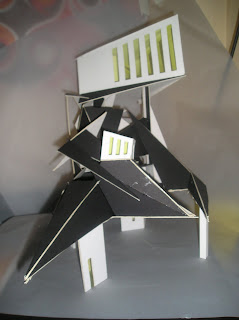
Ministry of Moral Order, New London, 2050
scale 1:250
Monday 1 November 2010
Saturday 15 May 2010
Zaha Hadid Queen of the World
''I don’t believe in relating to the environment per say. If you want to start afresh with something new and you are always relating to context.... What happened in the last thirty years the whole idea of context changed alot''
Zaha Hadid
(quote taken from utube interview)
http://www.youtube.com/watch?v=mk-vhQSycfI
As a final thought on my year I happened apon an interview with architect Zaha Hadid. I was struck by the above quote. It challenged alot of what I have learned so far at University and I believe she is right. Her work is amazing in every respect. She is showing a glowing image of what the future could be. Her buildings are refined reflections of images we have encountered in many a sci fi movie.
She certainly takes the organic to new and exciting possibilities. What strikes me in particular is how respectful of the landscape she is. I wait in absolute anticipation of the Acquatic Centre for the Olympics. I love the way the building grows from the landscape and in turn the landscape becomes and extension of the building. This to me is the way I would love landscape architecture to go. I have always felt that architects and landscape architects should work hand in hand. The building should reflect the landscape design and vice versa. So often I have looked at projects which have a building with one language and a landscape attached and neither of them have any partlicular relationship with each other. Its as if two egos are fighting for attention.
The above quote is important to me as it seems to say, design something new bold create a unique style and dont get bogged down in context. I thing this can be successful if both the landscape and the architecture work together to create this statement. If however you have two different design philosophies then there is too much confusion.
I remember we had some employees from Martha Schwartz come and give us a talk last year on a proposed project by the Thames in London. The design was slightly over the top. The site was surrounded by pretty big buildings which were marked on the plans and visualisations as boxs with no suggestion of what they look like. Someone did ask how the architecture looked. The designers couldnt answer that as they had not seen the plans for the buildings.
The overall site was big and as the buildings are new, I felt that there should be some strong language shared with the landscape design. The whole scheme (landscape and architecture) could then make a powerful statement and stand on its own. Something tells me it won't.
Zaha Hadid has explored the realms of design; architecture to furniture design, landscape to shoe designer. Her style, bold, elegant and stylish has a definite langauge but she is by no means a one trick pony. 'Iconic' architects like Gheary come and go, like seasonal trends but Zaha is here to stay. I anticipate that just as people start to accuse her of sameness in her design she will bring something new to the table.
Friday 14 May 2010
FOCUS WEEK MAY 2010: WORK EXPERIENCE & MAP EXHIBITION
I worked at Churchman's Landscape Architects. They are based near Twickenham High Street. Here are some examples of their work. They seem like a practice who are heavily into planting...
I helped them with preparing a presentation for a proposal in the Lea Valley. I worked on creating a current diagram of the various elements around the site; industry, residential etc.. I also began work on a future diagram, this involved looking at the site as it would become. Due to the Olympics the area is under going huge transformation. I had to examine architectural plans for the new Tesco, park and school proposal and add these elements to the diagram.
I am returning to work there next week.
This focus week also took me to the British Library at Kings Cross. I went to see the Magnificent Maps exhibition. Below are some images from this...
The exbibition was very interesting and housed in a rather nice gallery space at the library which I'd never been to. The pieces on show dated as far back as 1400's and showed the craftmanship involved in map making.
There were also some modern maps showing London from a different perspective. The map called Island was interesting. By artist Stephen Walter it showed London as an island. He had marked out in a kind of cartoon style the London that was relevant to him. The detail was amazing and it showed areas where he scored drugs, girlfriends, areas of ethnic groupings etc...
What stood out was the way maps were not just a drawing showing where things are but a social commentary of the time. Many of the maps showing far off lands like Africa and South America, often depicted strange fantastical animals and the natives as wild creatures.
What is also notable about maps is the way the maker will embellish a place. London for example has often been shown in its best light whereas there streets and areas filthy with poverty and corruption.
Visiting this exhibition was a nice completion of my year. I have been to the map room before, carrying out my own researh on the various projects I worked on. The collection on show is just a drop in the ocean compared to the millions of maps stored in the vaults below the British Library.
Saturday 1 May 2010
Project Highlights 2nd Year Kingston
A drawing I did on the field trip to Kings Cross.
Logo I created for the Semester Two Project
A model I made to show the raised walkway at Kings Cross...
Section...
Kings Cross, here is a visualisation of my proposal to create a raised walkway above the exisitng tow path at Kings Cross Regents Canal...
Kings Cross, a college of the Kings Cross area...
A collage to show the mood of Swiss Cottage North West London...
This is a detail section of the Swiss Cottage Open Space by Gustafson Porter...
Thursday 22 April 2010
Competitions...
As a class our Semester 2 project has given us the challange of entering an Architectural Competition. This has been challanging in terms of coming up with an architectural solution from a landscape point of view. Below are some images I found which show some impressive Architectural Presentation boards. I took inspiration from these in terms of layout. In the end I opted for a highly edited A1 board with one main selling image. My intention was to catch the audiences attention with this image. I wanted to convey a feeling of lush planting as well as show the strength of the architecture.
This project was a real journey for me in design terms. As the brief is architectural I started with a strong architectural statemenet. As I analysed the site, I soon reaslied a new philosophy and thought about the landscape as a way to express this. It was then the project turned around for me. I knew that I was now able to proceed joining both architecture and landscape together in what I think is a strong design as well as answering the brief.
This journey was a great experience. It meant thinking about a very clear and precise brief, tackling it from the clients point of view. This was interesting as well. The client had a very particular point of view here and whether or not I agreed with them, I found myself working towards their etos. Which by the way is not a bad one.
I will upload my A1 presentation board in a few weeks. I have just submitted it to competition and I will wait until shortlisting has been announced.
Below are some of the presentation boards I found inspiring.
Thursday 4 March 2010
FOCUS WEEK MARCH 2010: TRIP TO CORK & PHOTOGRAPHY TRAINING
View of Patrick St Cork from North Aspect
picture taken by David Layton
This week I travelled to Cork, a gorgeous little city in the South of Ireland. Cork a port city has changed alot through the years. It not only has changed in Town Planning terms but also in a multi cultural sense.
Ireland now welcomes people of all nationalities to live and work in the country. This has given rise to an explosion of apartment building very much in the language of London housing.
I notice some lovely architecture as well as plenty of questionable buildings dotted around the city centre. However Cork has impoved alot both in style and quality especially after winning City of Culture in 2005.
The following photographs show Cork's regeneration of their main high street, Patricks Street. Cork County Council hired the services of Barcelona Architect/Landscape Architect Beth Gali. She designed a brave and pleasent road scape. Using interesting coloured paving she signifies pedestrian areas as well as road ways.
As you move down Patrick Street the urban scape opens into almost what becomes a plaza. This is known in Cork as The Grand Parade. Beth Gali has created some lovely lighting as well as interesting seating with trees growing from their centres.
Of course Cork is an interesting city with an equally interesting outlook. In many ways conservative but never dull. Apparently there was an indifferent response to Gali's design. Many a comment included 'Arah, it was fine the way it was'...
The next few pics are of a whole new development on Patrick St. They have knocked down an entire old block of the city and created this modern shopping complex. The architecture is nice, clear, crisp but the winner here is the new street created. It connects Patrick St to the cultural area of the Crawford Art Gallery and Cork Opera House. This is also effective in its link to the cafe culture of Paul St. The actual road layout is fairly straightforward but it has a nice link with the architecture in its patterns. There are random circular cuts into the pavement which add a little detail. I liked the lamps which are almost like wall lights. They have a pleasant contempory look.
This week was also an chance to develop my photography skills. I had an appointment with Niall in the Photography Lab. He helped me light and photography my model.
This pic was taken with a wide angle lens. Notice the cool quirky play with persepctive. Also you can see the studio backdrop in the background.
A detail of the pilotis.
The shot taken with regular SLR lens.
FOCUS WEEK JAN 2010: NATIONAL THEATRE LANDSCAPE EXHIBITION AND DIGITAL TRAINING
The first part of focus week we attended a small exhibition at the National Theatre. It was a exhibition of photographs which were entered into a competition. The photography was nice and featured some amazing landscapes throughout Britain. There were some interesting pictures which took an usual look at a landscape, focusing on the details. I did notice that about 95% of the images used photoshop effects namely Curves.
photography by Alice Hankin
photo by Alice Hankin
Photo by Alice Hankin
The second part of focus week involved developing my digital skills. I launched myself into CAD and managed to create a basic plan with measurements. I also attempted to use CADs 3D modelling. This was tricky but I think with practice both will be useful.
Using some online tutorials on Utube I also worked on photoshop skills. In particular I had some fun playing with effects to alter faces. Here is an example of before and after of Helen Mirren...
The Cruel hand of time...
The magic of photoshop...
Subscribe to:
Posts (Atom)